I got lucky on the Huami’s Amazfit Bip smartwatch. The reference US price – on Amazon at least – is USD81/SGD111, and the suggested retail price for it locally here is SGD129. After the usual scouting around for the best bargain, I found a Qoo10 reseller offering it for SGD84. The item shipped quickly: it was placed on a Sunday late afternoon, and was delivered just two days later.
I’ve got quite a few comments after the first couple days of use. Like everything else I write about here, this isn’t a sponsored review: the item was paid out of my own pocket and for long-term use as a working device. This will be a long review, so it’s split into two parts.
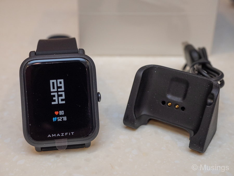
The packaging and contents are pretty minimalist. The watch comes in a small reinforced cardboard box, and inside you get the watch, the charging cradle with a permanently attached cable that connects to a standard USB Type A port, and a small leaflet with starter instructions printed in a tiny font on where to download the Mi Fit app and to pair the phone. There’s no printed user guide, like most mobile gadgets you can buy these days. You’ll need to grab the PDF user manual, as the Mi Fit app does not itself adequately explain how to use the watch.
The charging cradle is somewhat bulky though also very light. The cable permanently attached to the cradle is thin and feels flimsy. A fairly hard push is needed to fit the Bip into the cradle for charging, but there’s no chance you’d get it wrong: since the watch’s crown has its own cavity on the cradle i.e. you won’t be able to incorrectly fit the watch into the cradle. On the plus side, once the Bip is in the cradle, it doesn’t come off easily, e.g. from accidental knocks. Quite unlike the LG G Watch R or the super fiddly Huawei Smartwatch charging docks. I still think the Gear Sport’s wireless charging cradle is the best solution for these devices, but that I only need to charge the Bip once a month means that Huami’s implementation is a very occasional inconvenience at most.
The watch is very light! At 32g, it’s less than half the weight of the already fairly light Samsung Gear Sport at 67g, and I can definitely feel the difference when it’s worn on the wrist. However, unlike some reviewers who’ve commented that you won’t feel a thing wearing this light wearable, I can still feel it on my wrist: not from its 32g mass but its silicon strap.
The Bip took a while to pair up with my Samsung S8+, and I thought was also unnecessarily complex. I had to download the Mi Fit app from Google Play, sign-in with my Mi account, link it to my Google account, pair the watch with my s8+ (and that finally only worked after several attempts – maybe that it was also already paired to the Gear Sport?), and had to manually set notifications for each app I want the Bip to receive.
Once configured, the Bip works fine. I’ve not had to get to watch settings much after set-up. The UI is fairly simple to understand, though – coming from the Gear Sport’s rotating bezel – I still can’t instinctively know which directional swipe I should be doing to do what I need to do on the Bip.
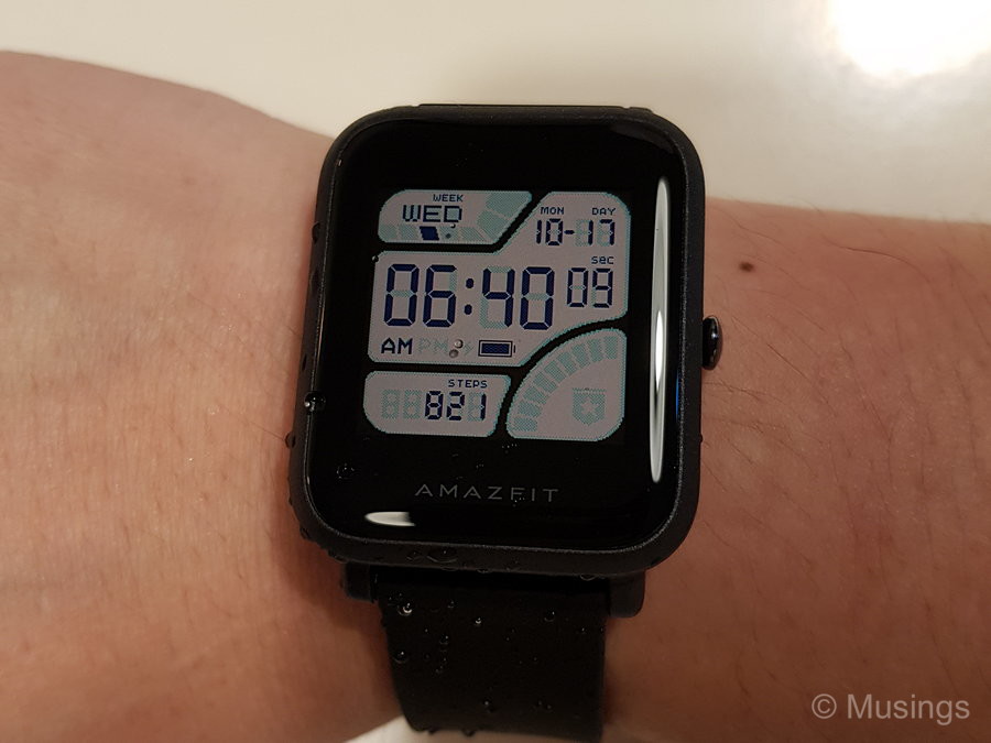
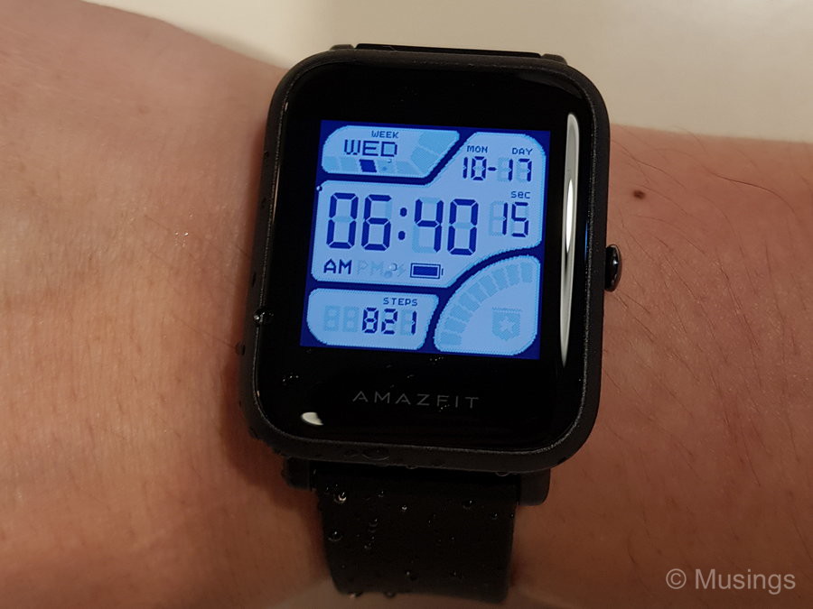
The Bip has ten watch faces built-in, most of which are downright ugly or just mediocre. That’s a major disappointment, coming from the fantastic watch faces I had on Android Wear and the Gear Sport. I couldn’t successfully get the Mi Fit app to download more faces. There are definitely alternate faces out there, though the instructions to get them onto the Bip are pretty involved LOL. I finally settled on the least offensive watch face that reminds me of the old Casio digital watches I wore as a teen.
A lot of reviewers have remarked that the Bip isn’t a particularly premium nor even attractive looking watch. I have to agree on that. Build-quality wise, the watch is sturdy yes but you won’t be mistaking anytime soon the watch’s polycarbonate exterior for an expensive alloy or material. As for its looks: the bezel surrounding the 1.28″ display is pretty thick, but choosing a digital-styled watch face helps alleviate that somewhat.
I was well aware of the Bip’s transflective screen‘s pros and cons before committing to the purchase. To put it simply: the display is functional, not attractive. Transflective screens work best when there’s at least some light around – because you can’t see anything on the screen when it’s dark, though a quick push on the Bip’s crown brings up its backlight. Enabling the watch’s raise wrist to wake feature will automatically turn the backlight when you, well, raise your wrist. Display colors look washed out, and most significantly, its pedestrian 176 x176 pixels means analog-type watch faces can look really bad on the Bip. I’ve been totally spoiled by the Gear Sport’s Amoled screen, which works well in both strong daylight and also night settings. The big advantage of the transflective screen of course is its low power draw which in turn contributes to the out of the world battery life on the Bip – something that a smartwatch with a Amoled screen would unlikely be ever able to match.


Continued in the next post!
Recent comments