Web site maintenance has certainly come a long way. There weren’t many sophisticated web site code creation tools available when our blog here went online 20 years ago. So, I wrote HTML code for every page using text editor tools like Notepad. Unlike procedural languages like C and C++, script languages are relatively simpler in its code constructs, and browsers allow for very quick compilation of site code for you to check if your output is behaving properly.
That was then. Web site tools today are capable of churning very attractive looking sites with little effort. I don’t remember the actual date when I moved our site from to a Content Management System like WordPress, but I’ll put it at about mid-2006 or so. Back at that point, the two big names in these platforms were Blogger and WordPress, with the former I remembered being the clearer market leader. WordPress on the other hand was already highly customisable back then, supported by a energetic enthusiast community who were already writing all kinds of plug-ins to extend the platform’s functionality, and most importantly, was open-source.
The latter characteristic is of particular import. Our web site was already self-hosted at that point, and there was no reason to change it to third party hosting. The advantage of open-source is of course that one can install the WordPress package files to your own hosting site and use it forever. With Blogger, your usage of the service depends entirely on how longer the owner of that service wants to keep it running. And it’s no guarantee that Blogger’s current owner – Google – will do exactly just that, as they already have shut down services over the years (anyone remembers Google Reader…?).
Still, whether Blogger or WordPress, Content Management Systems have the one key advantage: authors just need to worry about content. The all-in-one packaged WordPress themes typically also include built-in tools that allow one to adjust a range of parameters. The vast majority of bloggers I reckon will be happy with what these web site themes can produce. And if not, one could always engage the theme creator for a fee to further customize the theme to suit your specific needs.
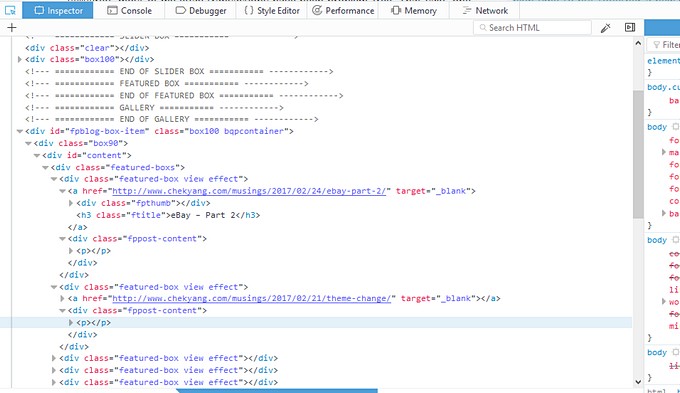
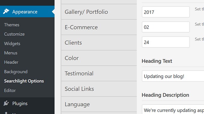
Not me though. I’m positively obsessive when it comes to getting our web site to look exactly the way I want it! The theme producer I purchased this bunch of current themes from has a pretty slick Admin panel within WordPress that permits customization, but the suite of options possible through that front-end still wasn’t quite enough for me. So, for the last several days I’ve been using the code inspector to take hard look at various site elements to see what I can do to get the look I want.

Of the list of things I’m trying to change. Those I’ve been able to fix so far:
The Slide Caption has a suggested limit of 20 words so that they don’t inadvertently overflow past the slide image on mobile browsers, but 20 words is just too limiting. A line to overwrite the minimum Caption width from 25% to 30% to fit just a bit more text solved that.
The Admin customization panel does not allow one to make changes to body text/font type, but fixed that code to overwrite the default setting. Oddly, the change propagated through to my iPads but not either of the Android phones. But two additional lines for font-weight and font-style lines also solved that.

Ditto for the site logo too. There are plenty of online logo creators out there that churn decent logos in minutes. But the free versions limit the logo size, and you need to pay to get the larger ones suitable for web use. I used Paint to quickly cobble together the current one sitting at the top left corner of our site, but I’ll do something better in the near future. Or maybe – rope Hannah in to draw one up for us LOL.
I didn’t like the default sidebar widget font, and there was no option to change it in the customization app. A custom code snippet fixed that.
There’s no option in the Admin panel to disable Featured Images in single posts. A query with the theme creator’s support service solved that nicely with also a line of code into the custom code box.
And those that are still in-progress:
The key post Slider sits its marker position on the extreme right side for desktop browsers, and bottom right corner for mobile browsers. I’d like it to be consistent across browsers. Also, on full-screen desktop browsers, all elements of each slide are displayed: Title, Sub-Title, and Caption. Funnily, on mobile browsers, only Caption is displayed and ostensibly because of limited bandwidth – but it doesn’t make sense. One would have thought that the Caption should make way for Title and/or Sub-Title instead. Still trying to find the elements which I can amend to make both changes.
The post-excerpts at the top-level page on this site is missing… an ellipsis for every post. Hate that. Also no luck finding where I can change it. In addition, I’d like the date meta info to be shown on post excerpts. Should be a reasonably easy change to make once I get to it.
The site still needs a Site Favicon. I’m art-challenged, but it’s still something I’ll get to – soon!
There are about 20 different themes in the package, so over the next couple of months, our site here might still significantly change in its look!
Recent comments