Things have been moving very briskly since the last post. The defect team in charge of our apartment unit at The Minton stated yesterday that the unit will be ready for the handover inspection early next week (excepting a couple of other items involving door signage and that the wire gauze of our kitchen oven has come loose). While we’re still not fully hundred percent confident that our apartment will have all defects excepting these two done by next Monday or Tuesday, we figured that any remaining defects can run concurrently with our renovation project since they involve areas where we’d not be doing major work on. Hence, we signaled our Interior Designer to begin preparations for the project to begin middle of next week.
One important service offered by Interior Designers is in the selection of colors, materials and accessories for one’s new home. Our designer had worked out the basic layouts for each of our major carpentry items – e.g. the shelving, the bedframes, storage areas – more than a month ago. Since that point, we’d reviewed those layouts and proposed various amendments. For example, children-proofing sharp and corner edges in our Master Bedroom furniture, removing the bed guard for Hannah’s bed. What remains thereafter is the selection of colors and surfacing materials, after which a final set of 3D renders will be prepared with these choices for us to sign off.
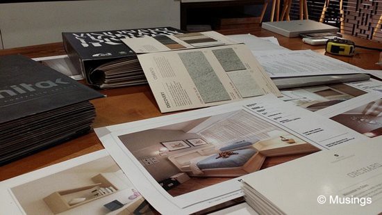
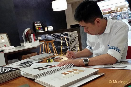
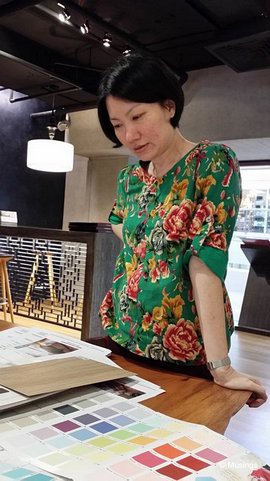
We spent most of the afternoon today deciding colors and materials with our designer, and we’re bowled over! Early on last year, we were briefly toying with the idea of managing our renovation project ourselves and going with specialist contractors for each renovation area. But we’re convinced now going with an ID was the right choice. We spent today to nearly 3 hours for us to decide on (most of – see below) our colors and materials! Lots of little details we would have missed our or misjudged had we try to do this on our own. Our designer took us through room by room, item by item, surface by surface. Things to consider included lighting conditions in the room against colors, whether certain types of laminate will bend well in manufacturing for curved edges, whether a particular color or material will fit well against others in the room, and trying to balance seeking thematic color consistency with some variety (‘safe’ vs ‘more adventurous’ colors). The carpentry items will also need to take into account the dimensions of devices it’ll hold. E.g. size of our media players, TV, dishwasher, washer/dryer stack etc.
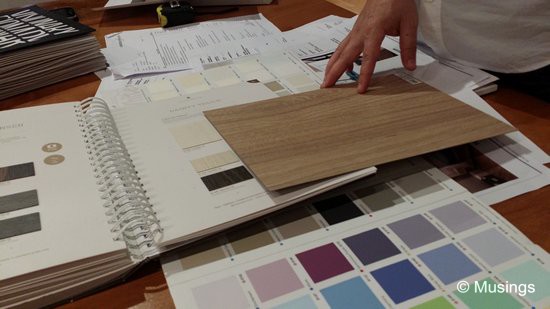
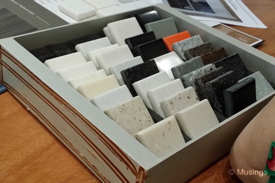
We’re still sticking with the general Scandinavian look and feel of our home for the living and dining common areas, but as we veer away from those areas, we’re taking more liberties with each room’s theme. So, while the living and dining room are going to be dominantly light colors with some shades of brown, the children’s room is going to feature more childlike colors (Ling liked Lavender for instance), while our own bedroom has strong brown colors. One thing’s for sure. There doesn’t seem to be much scientific basis for the choice of colors! A lot of it seemed to come down to intuition, and a mental projection of how a color will look like against another.
By the end of the meeting, we’d decided on the colors, laminate and solid surfacing materials for every room – excepting our Master Bedroom bedframe. We’re customizing the frame and going with a higher-grade of laminated veneer for its surfaces. Ling couldn’t quite decide on the frame’s surfaces, given that the catalog samples are quite small in size. Our designer thus invited us to join him to visit this particular laminate factory in the coming days – the factory is coincidentally quite near the designer’s office – to look at the large laminate sheets for us to have better decide which surface to go with.
Finalized renders to be posted once we get them.:)
Haha! Ling really looks like a lady boss here. :)